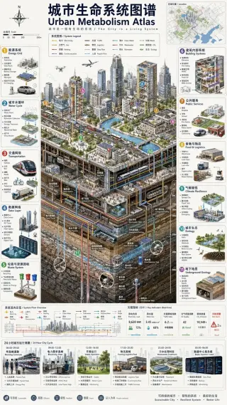
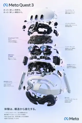
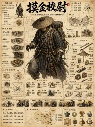
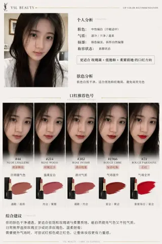
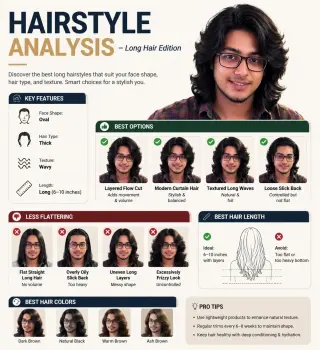
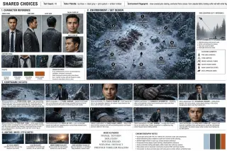
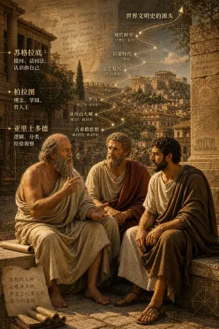
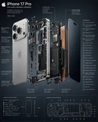
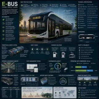
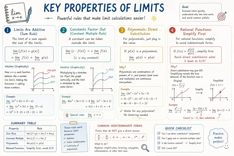
AP Calculus 学习表信息图
提示词原文
Please create a mathematical visualization infographic about "[math concept / topic]." The goal is to help the viewer intuitively understand what it is, why it works, its geometric or structural intuition, and how it behaves in different contexts. The visual should feel like a high-quality math lecture handout combined with a hand-drawn educational poster. It should be elegant, clear, and information-rich, but not cluttered. Visual style: either portrait or landscape is fine. Use a clean, light paper-like background, with a deep blue title and black or dark gray lines for the main content. Add a small number of refined accent colors such as blue, teal, gold, and red. Incorporate rounded-corner cards, thin borders, numbered labels, hand-drawn arrows, zoom-in callout boxes, and a summary section. The overall design should be aesthetically pleasing, balanced, and academic, allowing the viewer to grasp the structure of the concept and why it works at a glance.
复制后替换主体、场景或风格描述即可用;光影与镜头部分建议保留。
用这条提示词生成一张 在工作台粘贴提示词、选择模型即可生成,参考图可直接框选复用。
进入暮光TV案例参数
| 分类 | 图表与信息可视化 |
|---|---|
| 媒体类型 | 图片 |
| 提示词长度 | 970 字 |
| 标签 | UI · Infographic · Poster |
在库里的位置
| 图表与信息可视化类排名 | 第 5 长 / 共 7 条 |
|---|---|
| 全站位置 | 提示词长度超过 29% 的案例(全站 32 条) |
案例来源:@hqmank(https://x.com/hqmank/status/2048587150544028084)